How People Decide in 5 Seconds Whether to Stay on Your Website
(Code Nova Evolution: UX That Turns Attention Into Action)
5 Seconds — That’s All You’ve Got
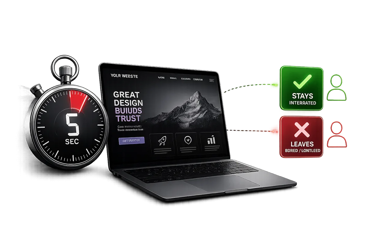
Five seconds. That’s how long it takes for a visitor to decide whether to stay on your website or leave for a competitor’s.
They don’t read the text.
They don’t analyze buttons.
They don’t dig into the details.
They simply look and feel:
“Is this clear? Is it trustworthy? Is it convenient?”
If the answer to even one of these questions is “no”, your website loses the client — even if everything was done “by the book.”
Why This Happens
Because we live in an era where attention is the most valuable currency.
Users don’t want to spend it figuring out your layout or searching for the right button.
They want to understand, in the very first second, what you offer — and why they should stay.
Those five seconds define everything:
-
Trust
-
Brand perception
-
And whether the user takes action — fills out a form, buys, or contacts you
The 5 Most Common UX Mistakes
Mistake #1: Focusing on “Beauty” Instead of Meaning
Yes, visuals matter. But flashy design won’t save you if users can’t tell what to do next.
We often see websites where visitors spend their first seconds wondering:
“What is this site even about?”
Overly creative fonts, minimalist navigation, endless animations, abstract slogans —
they might look great, but they destroy conversion.
UI/UX isn’t art — it’s psychology and logic.
Mistake #2: Information Overload
Trying to show “everything at once” is one of the costliest mistakes.
Huge text blocks, too many buttons, banners, pop-ups, sliders, promos — all crammed onto the first screen.
The result?
User attention scatters.
They leave without understanding what you offer.
Good UX means saying the right thing, at the right time — nothing more.
Mistake #3: Broken Visual Hierarchy
Users don’t read — they scan.
If everything on your page looks the same — same size, same color, same shape —
their eyes don’t know where to go.
Strong visual hierarchy means:
-
The main point is visible immediately
-
The button stands out
-
The structure naturally guides the user to take action
UX isn’t about being “trendy” — it’s about being “clear.”
Mistake #4: Lack of Trust
Even with great visuals and logic, users may leave if they don’t feel confident in you.
What builds trust:
-
Real photos, not stock images
-
Specifics: “5 years of experience,” “120+ clients trust us”
-
Case studies and client logos
-
Calm, professional messaging instead of loud promises
These details work on a subconscious level.
UX isn’t just about buttons — it’s about emotional honesty.
Mistake #5: No Micro-Navigation
Many websites focus only on the header and footer.
But users often land on inner pages — not the homepage.
If they can’t quickly navigate back, switch sections, or find a contact form,
they lose their sense of control.
That’s why every site needs:
-
Breadcrumb navigation
-
Clear CTAs at the bottom of each page
-
A visible contact button
Good UX gives users a sense of control — they always know where they are.
How 5 Seconds Turn Into Trust
At Code Nova Evolution, we design interfaces based on the principle of “attention → action.”
Every block, every screen answers three questions a user subconsciously asks:
-
What are they offering me?
-
Why does it matter to me?
-
What can I do right now?
We don’t use those first seconds to “impress.”
We use them to convince:
you’re safe here, it’s professional, and it’s clear.
Why UX Is Your Most Powerful Sales Tool
Good UX holds attention.
Smart design builds trust.
A clear structure leads to conversion.
Combine all three — and your site starts selling naturally,
without pressure or gimmicks.
It simply becomes comfortable for the client —
and that works better than any ad.
The Code Nova Evolution Approach
We don’t copy templates.
We build interfaces that understand your users.
-
Study audience behavior
-
Design structure for real scenarios
-
Test how users click, hesitate, and decide
-
Create designs that help, not distract
The result: a website that feels intuitive — even on the first visit.
The Bottom Line
You can spend on ads, SEO, and marketing,
but if users don’t understand who you are or why they should stay within the first 5 seconds —
nothing else matters.
UX isn’t a detail — it’s the foundation.
A strong UX website isn’t just a pretty storefront —
it’s a tool for sales, trust, and growth.